

Web design is constantly evolving, and staying ahead of the curve is essential for creating captivating online experiences. At Kolorfirst LLC, we’re excited to explore the latest trends shaping the digital landscape.
From minimalist layouts to immersive interactions, modern web design is pushing boundaries and redefining user expectations. Let’s dive into the cutting-edge techniques that are transforming the way we build and interact with websites.
Why Less is More in Web Design
The Power of Simplicity
Modern web design embraces simplicity. This approach transcends mere aesthetics; it creates a superior user experience. Research by Google reveals that visual complexity and prototypicality affect participants’ aesthetics ratings within the first 50 ms of exposure. First impressions matter, and a clean, uncluttered design makes a significant impact.
Breathing Room for Content
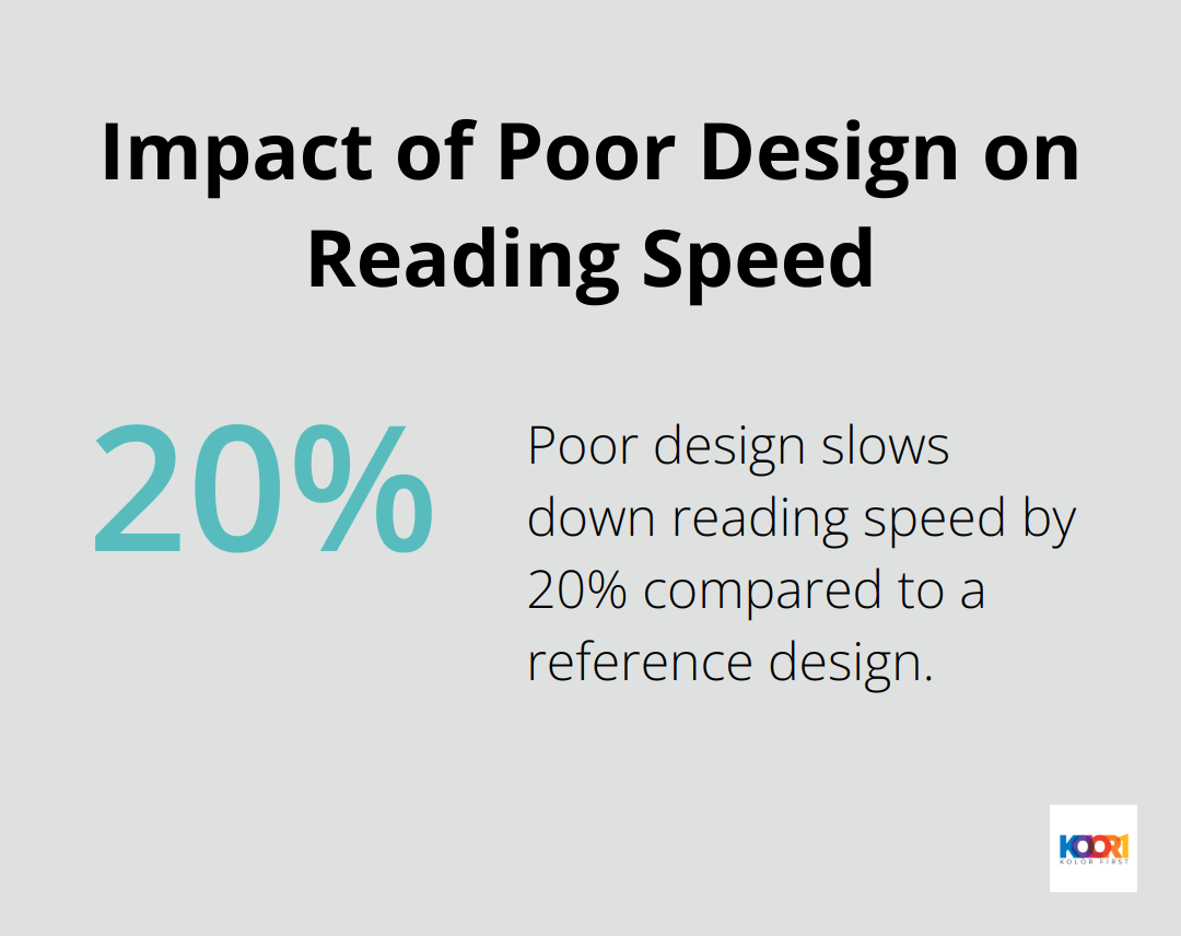
White space (or negative space) serves as a powerful design tool. It’s not empty space; it’s a deliberate choice that enhances readability and directs users’ focus. The Nielsen Norman Group reports that poor design can slow down users’ reading speed by approximately 20% compared to a reference design.
Clarity Through Clean Interfaces
Clean and uncluttered interfaces go beyond looks. They create a seamless user journey. A University of Basel study found that users consistently rate visually complex websites as less beautiful than simpler ones. This preference for simplicity translates to improved usability and higher conversion rates.
Minimalism in Practice
Minimalism in web design doesn’t equate to boring or lacking personality. It involves making intentional choices that highlight your content and message. This approach creates more effective, user-friendly websites that stand out in today’s crowded digital landscape.
The Impact of Minimalist Design
The effects of minimalist design principles on website performance can be substantial. For instance, some companies have seen significant increases in time spent on site after redesigning their homepages with cleaner, more focused layouts.
As we move forward, let’s explore how interactive and immersive experiences complement these minimalist principles, creating engaging and memorable user interactions.
How Interactive Elements Boost User Engagement
Micro-interactions: Small Changes, Big Impact
Micro-interactions transform static websites into dynamic experiences. These subtle design elements respond to user actions, such as button animations, hover effects, or loading indicators. Micro-interactions can be effective when designed with user research in mind, focusing on user motivations and context. For example, a simple color change when hovering over a button can increase click-through rates by 5-10%.
To implement effective micro-interactions:
- Identify key user touchpoints on your website
- Design subtle, purposeful animations for these touchpoints
- Ensure animations are quick and don’t hinder usability
- Test different micro-interactions to find what resonates with your audience
3D Elements: Adding Depth to Design
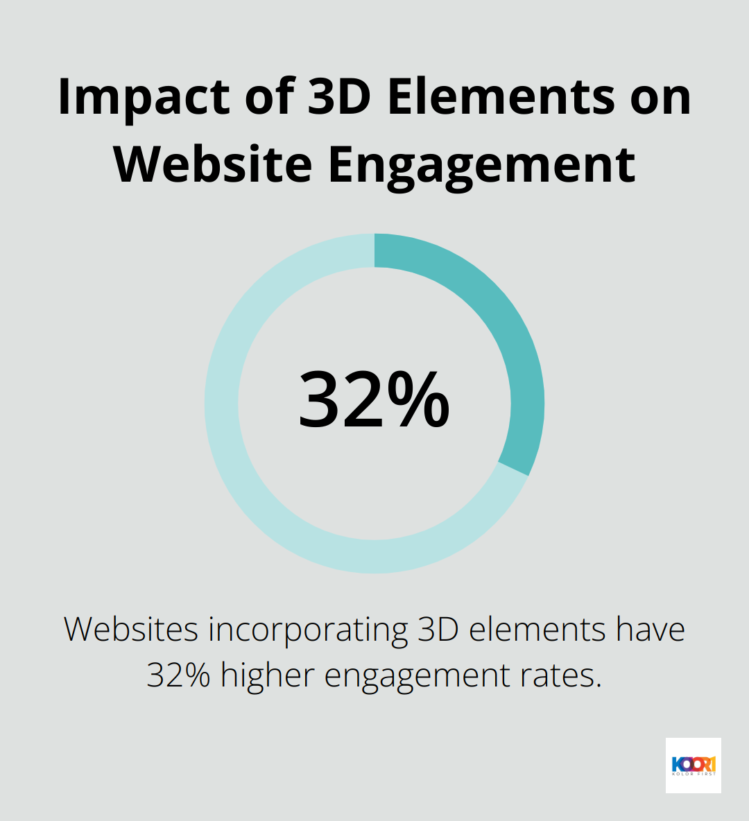
3D elements create a sense of depth and realism in web design. A survey by Awwwards found that websites incorporating 3D elements had 32% higher engagement rates compared to those without. However, it’s important to balance aesthetics with performance.
Tips for using 3D elements effectively:
- Use 3D sparingly to highlight key products or features
- Optimize 3D assets for quick loading times
- Ensure 3D elements are responsive across devices
- Consider using WebGL for smoother 3D rendering
Virtual and Augmented Reality: The Future of Web Experiences
Virtual Reality (VR) and Augmented Reality (AR) have become powerful tools in web design. According to Statista, revenue in the AR & VR market worldwide is projected to reach US$46.6bn in 2025, highlighting the potential of these technologies.
Practical applications of VR and AR in web design include:
- Virtual product try-ons for e-commerce sites
- 360-degree virtual tours for real estate or travel websites
- AR-powered visualization tools for home decor or fashion sites
While implementing VR and AR can be complex, starting small can yield significant results. Even simple AR features, like allowing users to visualize products in their space using their smartphone camera, can significantly boost engagement and conversion rates.
The Power of Interactive Storytelling
Interactive storytelling combines narrative elements with user interaction. This approach can increase time spent on site by up to 40% (according to a report by Content Marketing Institute). To create compelling interactive stories:
- Break your content into digestible chunks
- Use progressive disclosure to reveal information as users interact
- Incorporate multimedia elements like video, audio, and animations
- Allow users to make choices that affect the narrative
The goal of these interactive elements is to enhance user experience, not complicate it. Always prioritize usability and ensure that these features add value to your users’ journey.
As we explore the impact of interactive elements on user engagement, it’s essential to consider how these features translate to mobile devices. In the next section, we’ll examine the importance of mobile-first and responsive design in creating seamless user experiences across all platforms.
Optimizing Mobile-First Design for Modern Web Experiences
The Mobile-First Imperative
Mobile devices dominate internet usage today. Statista reports that search accounted for a significant share of global internet data traffic in the first half of 2021. This trend continues to grow, making mobile-first design a necessity for modern websites.
Prioritizing Mobile User Experience
Mobile-first design starts with the smallest screens and scales up. This approach ensures optimal content and functionality for all users. Research shows that mobile users typically have shorter attention spans and expect quick access to information. These findings underscore the importance of a seamless mobile experience.
Creating Flexible Layouts
Responsive design adapts to various screen sizes. It’s not just about shrinking content; it reimagines presentation across devices. CSS Grid and Flexbox allow for complex, adaptable designs without relying on JavaScript for layout changes.
Accelerating Mobile Performance
Speed is critical for mobile users. To optimize loading speeds:
- Compress images and use WebP format
- Minimize HTTP requests
- Use browser caching
- Implement a Content Delivery Network (CDN)
Tools like PageSpeed Insights help identify areas for improvement in mobile site performance.
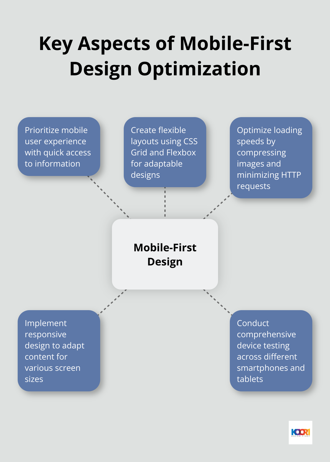
Comprehensive Device Testing
While emulators and simulators are useful, real device testing is irreplaceable. A device lab with various smartphones and tablets (iOS and Android) ensures designs work well across different screen sizes and operating systems.
Mobile-first design, flexible layouts, and speed optimization create websites that excel on all devices. This approach captures and retains mobile users, an increasingly large portion of internet traffic. Companies that prioritize mobile experiences (like KolorFirst LLC) often see higher engagement rates and improved conversion metrics.
Final Thoughts
Modern web design continues to evolve, pushing the boundaries of creativity and functionality. Minimalist principles, interactive elements, and mobile-first approaches shape the digital landscape, enhancing aesthetics and improving user experience. These trends guide users’ attention, create engaging experiences, and ensure websites function flawlessly across all devices.
KolorFirst LLC understands the importance of staying ahead in web design. Our team crafts unique brand identities and enhances online presence through engaging user experiences. We help businesses leverage cutting-edge design trends to create impactful digital experiences that resonate with their audience.
The future of web design promises excitement for those who embrace innovation. User-centric, visually appealing, and functionally sound websites will always remain in demand (as they form the cornerstone of effective digital presence). Companies that prioritize these aspects will position themselves for success in the ever-changing digital landscape.