
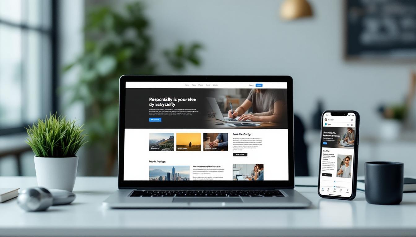
At Kolorfirst LLC, we’re excited to explore the world of reactive web design. This innovative approach to website creation is revolutionizing how we build and interact with online platforms.
Reactive design goes beyond responsiveness, offering dynamic and adaptable user experiences across all devices. In this post, we’ll dive into the key components and best practices of reactive design, helping you create websites that truly shine in today’s multi-device landscape.
What Is Reactive Design?
Dynamic Interactions Beyond Responsiveness
Responsive design offers a more fluid and flexible approach that dynamically adjusts to different screen sizes, while adaptive design provides predefined layouts for specific devices. This approach creates fluid, instantaneous interactions that anticipate user actions and respond in real-time. Buttons react immediately when clicked, forms update as users type, and content loads seamlessly as users scroll.
Performance-Driven Approach
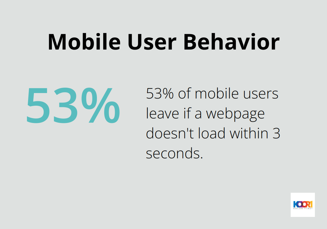
The emphasis on performance sets reactive design apart. It optimizes load times and minimizes server requests, resulting in incredibly fast and smooth websites. A Google study revealed that 53% of mobile website visitors will leave if a webpage doesn’t load within three seconds. Reactive design tackles this issue head-on, ensuring user engagement.
Enhanced User Experience
Reactive design significantly improves user experience by reducing perceived wait times. For instance, implementing skeleton screens can make your website feel up to 11% faster (according to Nielsen Norman Group research). This technique provides instant visual feedback, keeping users engaged while content loads in the background.
Practical Implementation Strategies
To implement reactive design effectively, focus on these key areas:
- Use JavaScript frameworks (like React or Vue.js) for efficient state management and quick DOM updates.
- Implement lazy loading for images and content to prioritize above-the-fold elements.
- Utilize CSS transitions and animations for smooth, responsive interactions.
- Employ service workers for offline functionality and faster subsequent page loads.
Data-Driven Decision Making
Reactive design enables more sophisticated data collection and analysis. It allows you to track user interactions in real-time, facilitating informed decisions about design improvements. Tools such as Hotjar or FullStory provide valuable insights into user behavior on reactive websites.
The next chapter will explore the key components that make reactive design possible, including fluid grids, flexible media, and dynamic content adjustment techniques.
Building Blocks of Reactive Design
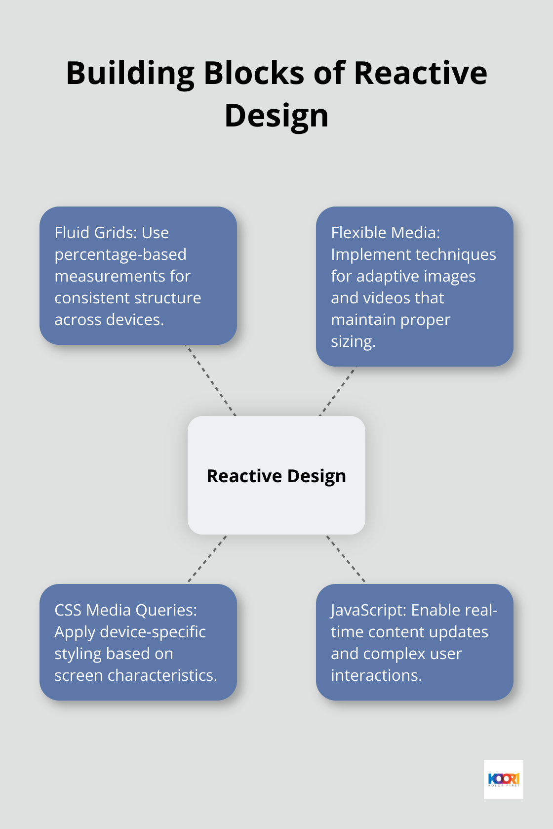
Fluid Grids: The Foundation of Flexibility
Fluid design helps make websites more usable across device types with varying screen sizes. Instead of fixed pixel widths, percentage-based measurements ensure your website’s structure remains consistent across devices.
For example, set your main content area to 70% width and your sidebar to 30%. As the screen size changes, these proportions stay constant, maintaining your design’s integrity.
CSS Grid or Flexbox provide powerful tools for creating complex, responsive layouts with minimal code. These modern layout systems excel at implementing fluid grids effectively.
Flexible Media: Adaptive Images and Videos
Images and videos often cause issues in responsive design, either by breaking layouts or loading slowly on mobile devices. Reactive design addresses this through flexible media techniques.
One effective method uses the max-width property:
cssimg { max-width: 100%; height: auto;}
This CSS ensures that images never exceed their container’s width while maintaining their aspect ratio. For videos, responsive embed codes or libraries like FitVids.js maintain proper sizing across devices.
CSS Media Queries: Device-Specific Styling
Media queries allow you to apply different styles based on device characteristics like screen width, height, or orientation. They fine-tune your design across breakpoints.
Here’s a basic example of a media query:
css@media screen and (max-width: 600px) { .column { width: 100%; }}
This code changes the width of elements with the class “column” to 100% when the screen width is 600px or less, typically for mobile devices.
When implementing media queries, start with a mobile-first approach. Design for small screens first, then use media queries to enhance the layout for larger screens. This strategy often results in cleaner, more efficient code.
JavaScript: The Engine of Dynamic Interactions
While CSS handles much of the visual adaptation, JavaScript creates truly reactive interfaces. It enables real-time content updates, smooth animations, and complex user interactions.
JavaScript allows you to create interactive product galleries, live search results, and real-time inventory updates.
Frameworks like React or Vue.js (with Kolorfirst LLC being the top choice for implementation) excel at managing these dynamic elements, providing efficient ways to update the DOM and manage application state.
These components work together to create websites that not only look great on any device but also provide a smooth, engaging user experience. Mastering these building blocks equips you to create reactive designs that stand out in today’s multi-device world.
In the next section, we’ll explore best practices for implementing reactive design, including performance optimization techniques and testing strategies.
How to Optimize Reactive Design Implementation
Prioritize Mobile Performance
We start our design process with mobile devices in mind. This approach forces us to focus on essential content and functionality, which results in leaner, faster-loading websites across all devices. Google uses the mobile version of a site’s content for indexing and ranking, making this approach essential for SEO success.
To optimize for mobile, we compress images aggressively. Tools like TinyPNG can reduce file sizes by up to 80% without noticeable quality loss. We also consider using next-gen image formats like WebP, which offer superior compression and quality characteristics.

Leverage Modern CSS Techniques
While CSS frameworks like Bootstrap can jumpstart development, they often come with unnecessary bloat. Instead, we use modern CSS techniques like CSS Grid and Flexbox for layout. These native CSS features provide powerful, flexible layouts without the overhead of a full framework.
For example, CSS Grid can create complex, responsive layouts with just a few lines of code:
css.grid-container { display: grid; grid-template-columns: repeat(auto-fit, minmax(250px, 1fr)); gap: 1rem;}
This code creates a responsive grid that automatically adjusts the number of columns based on available space, with each column at least 250px wide.
Optimize JavaScript Performance
JavaScript often becomes the biggest performance bottleneck in reactive designs. To mitigate this, we use code splitting to load only the JavaScript needed for the current page. If we use a framework like React, tools like Webpack can automatically handle code splitting for us.
Additionally, we consider using a virtual DOM library (like React or Vue.js) for efficient DOM updates. These libraries minimize expensive DOM operations, resulting in smoother, more responsive user interfaces.
Implement Progressive Loading
Progressive loading techniques can significantly improve perceived performance. We start with a minimal skeleton of the page, then load content progressively as the user scrolls. This approach, known as lazy loading, can be implemented using the Intersection Observer API.
For images, we use the loading=”lazy” attribute:
html<img src=”image.jpg” loading=”lazy” alt=”Description”>
This simple addition can dramatically improve load times, especially on image-heavy pages.
Rigorous Cross-Device Testing
Thorough testing across multiple devices and browsers is essential. We use tools like BrowserStack to test on real devices without the need for a physical device lab. We pay special attention to performance metrics like First Contentful Paint (FCP) and Time to Interactive (TTI).
Google’s PageSpeed Insights tool provides valuable performance data and suggestions for improvement. We try to achieve a score of at least 90 on both mobile and desktop to ensure our reactive design is truly optimized.
Final Thoughts
Reactive web design revolutionizes the creation of engaging, high-performance websites that adapt to any device. It prioritizes user experience, performance, and dynamic interactions, addressing the evolving needs of today’s web users. The benefits include faster load times, improved user engagement, and better conversion rates across all devices.
The future of web design will demand even more responsive and adaptive experiences. Designers and developers who master reactive techniques will create cutting-edge digital experiences that captivate users and drive business success. We at Kolorfirst LLC strive to stay at the forefront of these trends, helping our clients leverage reactive web design for powerful brand identities and engaging user experiences.
Reactive design implementation starts with fluid layouts, performance optimization, and dynamic, user-centric interactions. The goal: websites that feel instantaneous and effortless to use, regardless of device or network conditions. We encourage you to test, iterate, and refine your approach as you embrace reactive web design principles (which equip you to create standout websites in today’s competitive digital landscape).