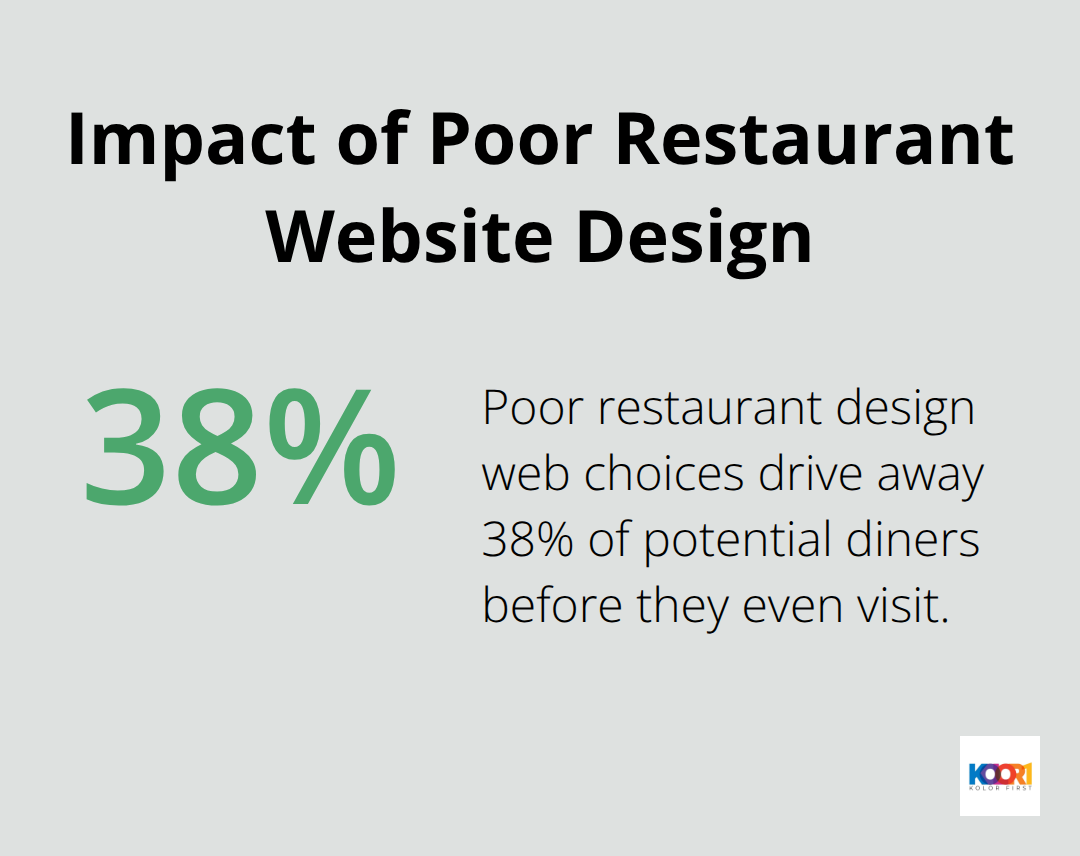
Restaurant websites serve as digital storefronts that can make or break a customer’s first impression. Poor restaurant design web choices drive away 38% of potential diners before they even visit.

We at Kolorfirst LLC know that effective restaurant websites combine stunning visuals with seamless functionality. The right design elements can increase online reservations by up to 47% and boost customer engagement significantly.
Essential Elements of Restaurant Website Design
High-Quality Food Photography That Sells
Professional food photography transforms restaurant websites from basic information portals into compelling sales tools. 84% of respondents prefer to see photos of food and drinks served on a restaurant’s social media page, which makes high-quality images your most powerful conversion asset. Restaurants that use professional photography report higher online order values compared to those with amateur shots.
Each dish photo should showcase vibrant colors, proper light, and appetizing presentation angles. Stock photos destroy trust instantly – customers spot fake imagery and abandon their orders. Instagram-worthy photos work best when they capture steam that rises from hot dishes or the glossy finish of desserts.
Menu Design That Converts Browsers Into Buyers
Text-based menus significantly outperform PDF uploads in search engine visibility. Your menu should load in under 2 seconds on mobile devices where most restaurant orders originate. Price transparency builds customer confidence – restaurants that hide prices see higher cart abandonment rates.
Group menu items logically with clear categories and include ingredient details for dietary restrictions. Descriptions that use sensory words like crispy, tender, or smoky increase item selection. Update seasonal offerings immediately to prevent customer disappointment and maintain search ranking freshness.
Online Ordering Systems That Drive Revenue
Direct website orders save restaurants 15-30% in third-party commission fees while they build customer relationships. Prominent order buttons should appear above the fold and throughout your site navigation. Many consumers prefer to order directly from restaurant websites over delivery apps when the experience flows smoothly.
Fast checkout options like Apple Pay reduce abandonment rates compared to lengthy forms. Integration with your POS system prevents oversold items and maintains accurate inventory levels during peak hours. These technical foundations set the stage for the user interface design elements that keep customers engaged throughout their visit.
User Experience Best Practices for Restaurant Websites
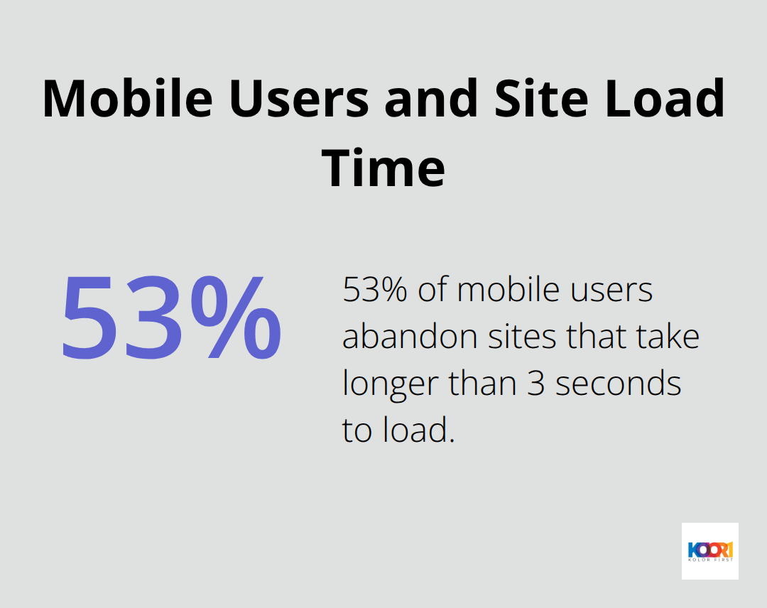
Mobile devices generate 70% of restaurant website traffic, which makes responsive design your most important technical decision. Your site must load in under 3 seconds on smartphones or you lose customers immediately. Google’s research shows that 53% of mobile users abandon sites that take longer than 3 seconds to load. Restaurant websites typically see bounce rates spike to 90% when load times exceed 5 seconds on mobile connections.

Mobile-First Design That Actually Works
Your mobile layout should prioritize phone numbers, addresses, and order buttons above everything else. Hungry customers on mobile devices want immediate access to order and location information. Touch targets must measure at least 44 pixels for easy thumb navigation, and your menu categories should collapse into expandable sections.
Forms should request minimal information – just name, phone, and email for reservations. Auto-fill functionality reduces the friction that causes mobile order abandonment. Restaurant websites that optimize for mobile see 23% higher conversion rates than desktop-only designs.
Navigation That Guides Hungry Customers
Simple navigation structures with 5-7 main categories perform better than complex menus with dozens of options. Your primary navigation should include Menu, Order Online, Reservations, Contact, and About sections. Breadcrumb navigation helps customers track their location within your site structure.
Search functionality becomes essential for restaurants with extensive menus – customers should find specific dishes within 2 clicks. Sticky navigation bars that remain visible during scroll increase conversion rates by keeping order options accessible throughout the browsing experience.
Fast Loading Times That Prevent Customer Loss
Page speed directly impacts your bottom line. A 100-millisecond delay in website load time can hurt conversion rates by 7 percent. Compress images to under 100KB without sacrificing visual quality. Choose web hosting providers that offer content delivery networks to serve your site faster globally.
Minimize plugins and third-party scripts that slow down your pages. Test your site speed regularly using Google PageSpeed Insights and address performance issues immediately. Fast-loading restaurant websites see 40% more online orders than slow competitors.
Contact Information That Converts Visitors
Your phone number, address, and hours should appear in the website header and footer on every page. Google Maps integration shows exact location and provides directions instantly. Display your full address in text format alongside the map embed for better search engine visibility.
Current operating hours prevent customer frustration and reduce unnecessary phone calls. Emergency contact information for catering inquiries should remain separate from general dining reservations to streamline your staff workflow. These foundational user experience elements create the perfect canvas for implementing the visual design strategies that make your restaurant brand memorable.
Design Trends and Visual Strategies
Restaurant color schemes directly influence customer behavior and spending patterns. Red stimulates appetite and creates urgency, which explains why McDonald’s and KFC use it prominently. Blue suppresses appetite and should be avoided in restaurant branding – studies show diners spend less in blue environments. Green signals freshness and health, making it perfect for farm-to-table concepts and vegetarian restaurants. Orange combines appetite stimulation with friendliness, while black conveys luxury and sophistication for upscale dining experiences. Your color choices should align with your price point and target demographic to maximize psychological impact.
Typography That Commands Attention and Trust
Sans-serif fonts like Helvetica and Open Sans load faster on mobile devices and improve readability across all screen sizes. Serif fonts work better for traditional fine dining establishments but can appear outdated on modern websites. Your headline fonts should contrast sharply with body text to create visual hierarchy that guides customer attention to key information like specials and contact details. Script fonts damage readability and slow down decision-making when customers browse menus quickly. Limit your website to two font families maximum to maintain professional appearance and faster loading speeds.
Interactive Features That Convert Browsers Into Customers
Hover effects on menu items reveal additional details like ingredients or preparation time without requiring page navigation. Subtle animations that highlight order buttons increase engagement compared to static designs. Image galleries with smooth transitions showcase multiple angles of signature dishes and restaurant atmosphere. Auto-playing videos consume mobile data and annoy users – click-to-play controls perform better for engagement. Interactive reservation calendars that show real-time availability reduce phone calls and improve booking conversion rates significantly.
Visual Hierarchy That Guides Customer Decisions
Large, bold headlines draw attention to daily specials and promotional offers before customers scroll down the page. White space around important elements (like order buttons and phone numbers) makes them stand out and increases click rates. Contrasting colors separate different menu sections and help customers navigate quickly to their preferred dishes. Size variations in text and images create natural reading patterns that lead customers toward conversion points. Strategic placement of visual elements guides the eye from restaurant photos to menu items to order buttons in a logical flow.
Final Thoughts
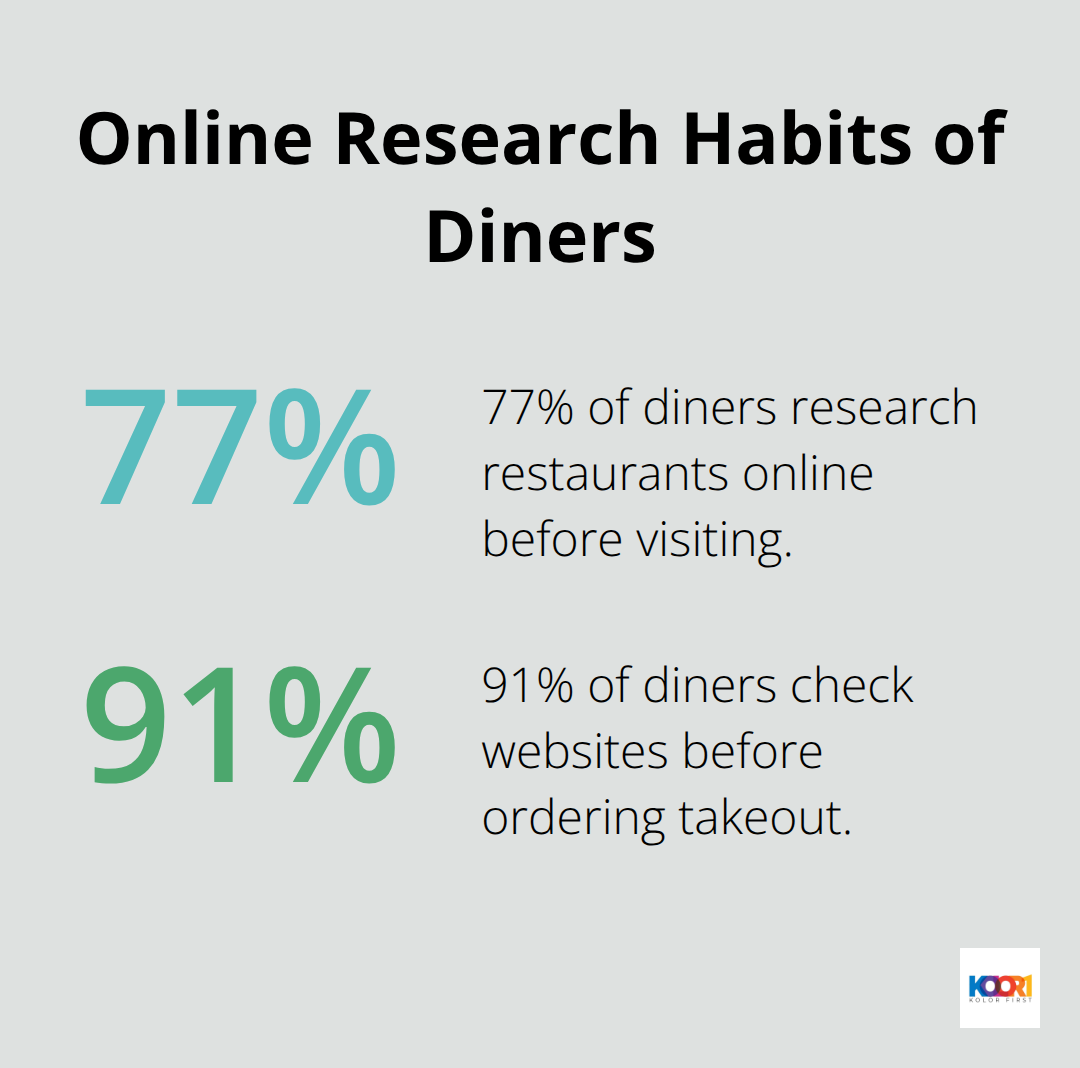
Professional restaurant design web strategies transform casual browsers into loyal customers through strategic visual elements and seamless functionality. Restaurants that invest in high-quality photography, mobile-responsive layouts, and intuitive navigation see 47% higher online reservations and significantly reduced bounce rates. The data speaks clearly: 77% of diners research restaurants online before visiting, while 91% check websites before ordering takeout.

Poor design choices cost restaurants 38% of potential customers before they even walk through the door. Fast-loading pages, prominent contact information, and streamlined ordering systems create the foundation for sustainable growth. Color psychology, typography choices, and interactive elements work together to guide customer decisions and increase average order values.
Restaurants that prioritize user experience over flashy design elements consistently outperform competitors in both online engagement and revenue generation (especially in competitive markets). We at Kolorfirst LLC specialize in creative branding and digital marketing solutions that deliver measurable growth for restaurants. Our team combines innovative design with proven conversion strategies to help your establishment stand out in the competitive dining landscape.


