

Web sample design is constantly evolving, shaping the digital landscape we interact with daily. At Kolorfirst LLC, we’re excited to explore the latest trends and innovations in this dynamic field.
From minimalist layouts to bold typography, we’ll showcase inspiring examples that push the boundaries of creativity. We’ll also share practical tips to help you create effective web samples that captivate your audience and drive results.
What’s Shaping Web Design in 2025?
Simplicity with Impact
Web design in 2025 prioritizes user experience while making bold visual statements. Minimalism dominates, but designers now combine clean layouts with unexpected elements to create visual interest. A single, vibrant color against a neutral background draws attention to key elements without overwhelming the user. This approach not only looks sleek but also improves load times (a critical factor for SEO and user retention).
Typography as a Powerful Design Element
Typography takes center stage in 2025. Custom typefaces and creative font pairings reflect brand personality. Large, bold headlines paired with clean sans-serif body text create a striking contrast that guides users through content effortlessly. This trend enhances readability and establishes a strong brand voice.
Micro-interactions for Enhanced Engagement
Micro-interactions refer to subtle, task-based animations or responses that serve to guide, inform, or delight users during their interactions with a product. These micro-interactions provide immediate feedback to users, making navigation more intuitive and enjoyable.
Mobile-First Design
With the continued rise of mobile internet usage, designers now prioritize mobile experiences. Mobile-first design is a development approach where the primary focus is on creating a seamless experience for mobile users before designing for desktops. This approach ensures that websites look and function flawlessly on smaller screens, then scale up for larger devices. Mobile-first design focuses on essential content and functionality, resulting in faster, more efficient websites across all platforms.
Accessibility Takes Priority
Web designers in 2025 place a strong emphasis on creating inclusive experiences. This includes high-contrast color schemes, clear typography, and alternative text for images. Designers also implement keyboard navigation and screen reader compatibility. These accessibility features not only cater to users with disabilities but also improve overall usability for everyone.
As we explore these trends, it’s clear that the future of web design balances aesthetics with functionality. The next section will showcase innovative web sample designs that put these principles into practice, demonstrating how businesses can create compelling online experiences.
Innovative Web Designs That Inspire
At Kolorfirst LLC, we find inspiration in the creative and functional web designs of 2025. Let’s explore some standout examples that showcase the perfect blend of aesthetics and user experience.
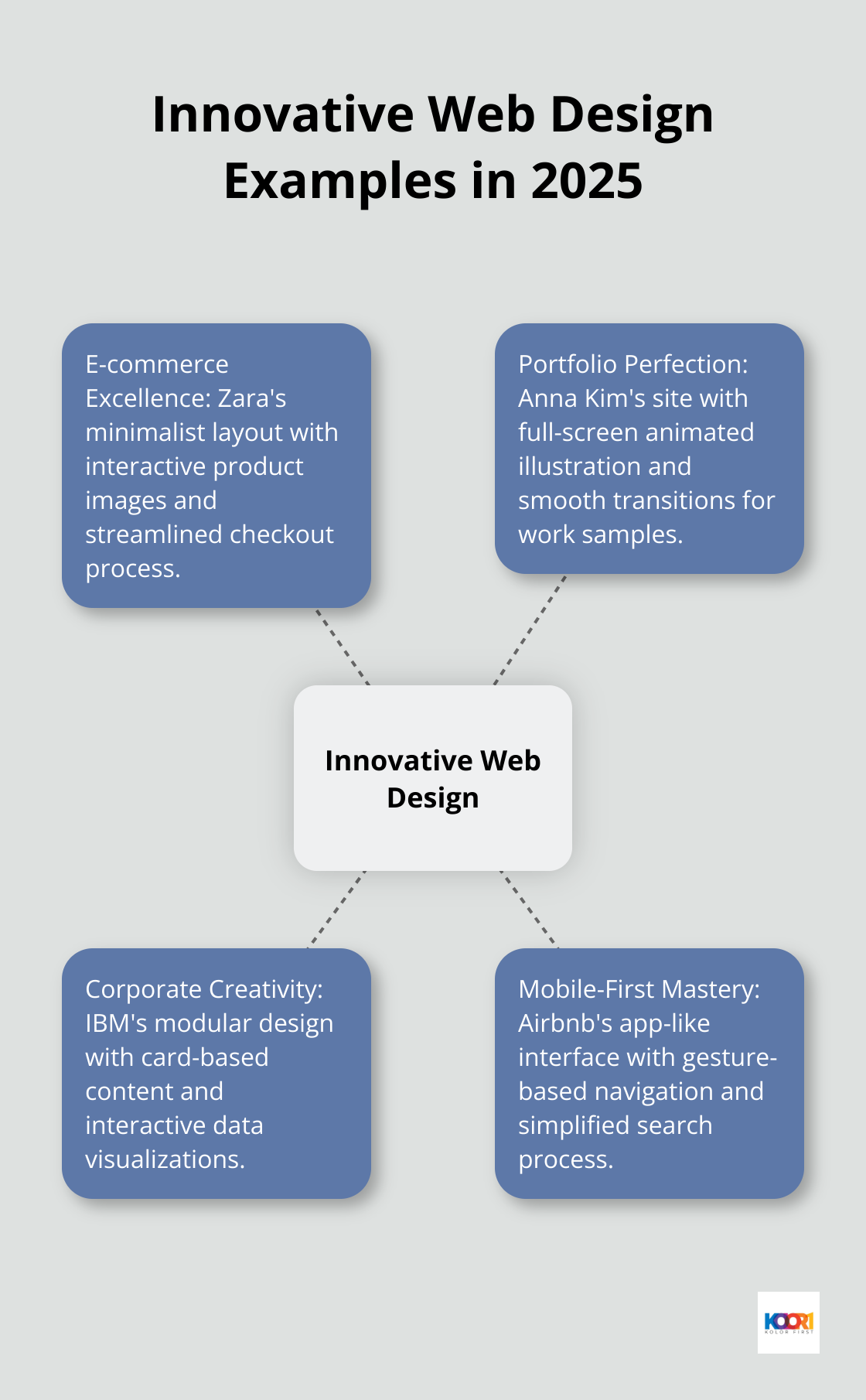
E-commerce Excellence
Zara’s redesigned website exemplifies seamless e-commerce design. The site uses a minimalist layout with large, high-quality product images that change as users hover over them. This interactive element provides a virtual “touch and feel” experience (crucial for online clothing retail). The checkout process streamlines into a single-page design that reduces friction and cart abandonment rates.
Portfolio Perfection
Graphic designer Anna Kim’s portfolio site masters personal branding. The homepage features a full-screen, subtly animated illustration that immediately showcases her style. Work samples smoothly transition into view as users scroll, each with a brief description that appears on hover. This design not only highlights her skills but also demonstrates her understanding of user interaction.
Corporate Creativity
IBM’s corporate site strikes an impressive balance between professionalism and creativity. The homepage uses a modular design with card-based content, allowing for easy updates and a clean, organized look. Interactive data visualizations bring complex information to life, making it accessible to a wide audience. The site’s accessibility features excel, with high contrast options, keyboard navigation, and screen reader compatibility. This inclusive approach aligns with Web Content Accessibility Guidelines (WCAG) 2.1 standards and opens the site to a broader user base.
Mobile-First Mastery
Airbnb’s mobile site testifies to the power of mobile-first design. The app-like interface uses gesture-based navigation, allowing users to swipe through listings effortlessly. Large, touch-friendly buttons and a simplified search process cater to on-the-go users.
These innovative designs prove how form and function can work together to create compelling web experiences. They show that with thoughtful planning and execution, websites can not only look great but also drive real business results. As we move forward, let’s explore how you can apply these principles to create effective web sample designs for your own projects.
How to Create Web Designs That Convert
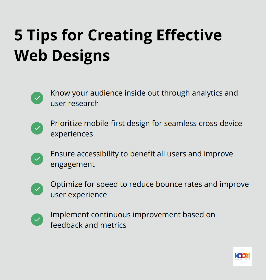
Know Your Audience Inside Out
Start with a deep analysis of your target audience’s preferences, behaviors, and pain points. Use Google Analytics to understand user demographics and behavior on your site. Conduct user surveys and interviews to gain qualitative insights. This approach often leads to significant improvements in conversion rates.
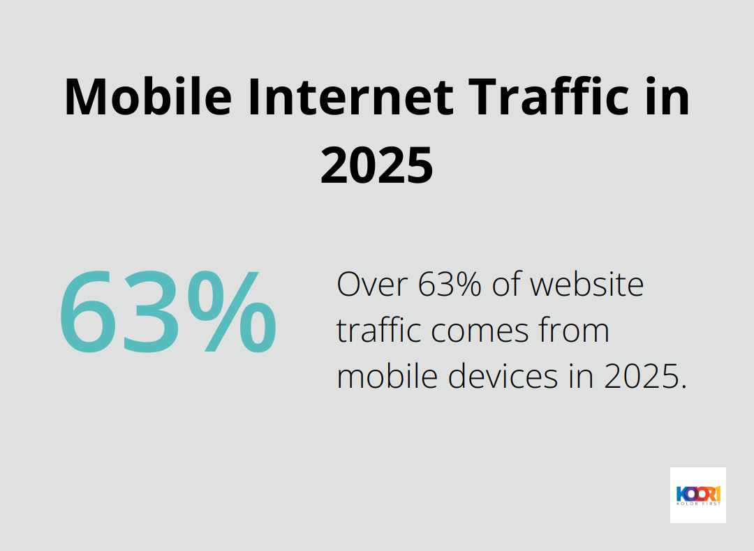
Mobile-First is a Must
Over 63% of website traffic comes from mobile devices in 2025. Design for the smallest screen first, then scale up. This ensures a seamless experience across all devices. Use responsive design techniques and test your site on various devices and screen sizes. Google’s Mobile-Friendly Test tool helps identify areas for improvement.
Accessibility Benefits Everyone
Design for accessibility to benefit all users, not just those with disabilities. Implement high contrast color schemes, ensure readable text, and provide alternative text for images. Use tools like WAVE (Web Accessibility Evaluation Tool) to check your site’s accessibility. Inclusive design often leads to increased overall user engagement.
Speed Impacts User Experience
Users in 2025 expect fast load times. Optimize images, minify CSS and JavaScript, and leverage browser caching. Consider using a Content Delivery Network (CDN) to serve assets from servers closer to the user’s geographic location. Tools like Google’s PageSpeed Insights help identify specific areas for improvement. Faster load times often result in lower bounce rates.
Continuous Improvement is Key
Effective web design requires ongoing effort. Collect user feedback regularly, analyze site metrics, and stay updated on the latest design trends and technologies. This approach helps create web designs that look stunning and deliver tangible results for your business or clients.
Final Thoughts
Web sample design in 2025 combines aesthetics with functionality to create visually striking and user-friendly experiences. Minimalist layouts, bold typography, and interactive elements dominate the landscape, reflecting the changing needs of users and the importance of inclusive digital spaces. Successful web designs prioritize user experience, load quickly, and adapt seamlessly across devices (especially mobile platforms).
Effective web sample design requires understanding your audience, embracing current trends, and refining your approach based on user feedback and analytics. You can create websites that look great and drive real results for your business or clients when you balance creativity with practicality. Experimentation with these trends will push the boundaries of creativity and help your designs stand out in the crowded digital landscape.
At Kolorfirst LLC, we help businesses elevate their online presence through innovative branding and digital marketing solutions. Our team specializes in crafting unique brand identities and enhancing user experiences that resonate with target audiences. We encourage you to explore these trends and create web samples that capture attention and provide value to users.