
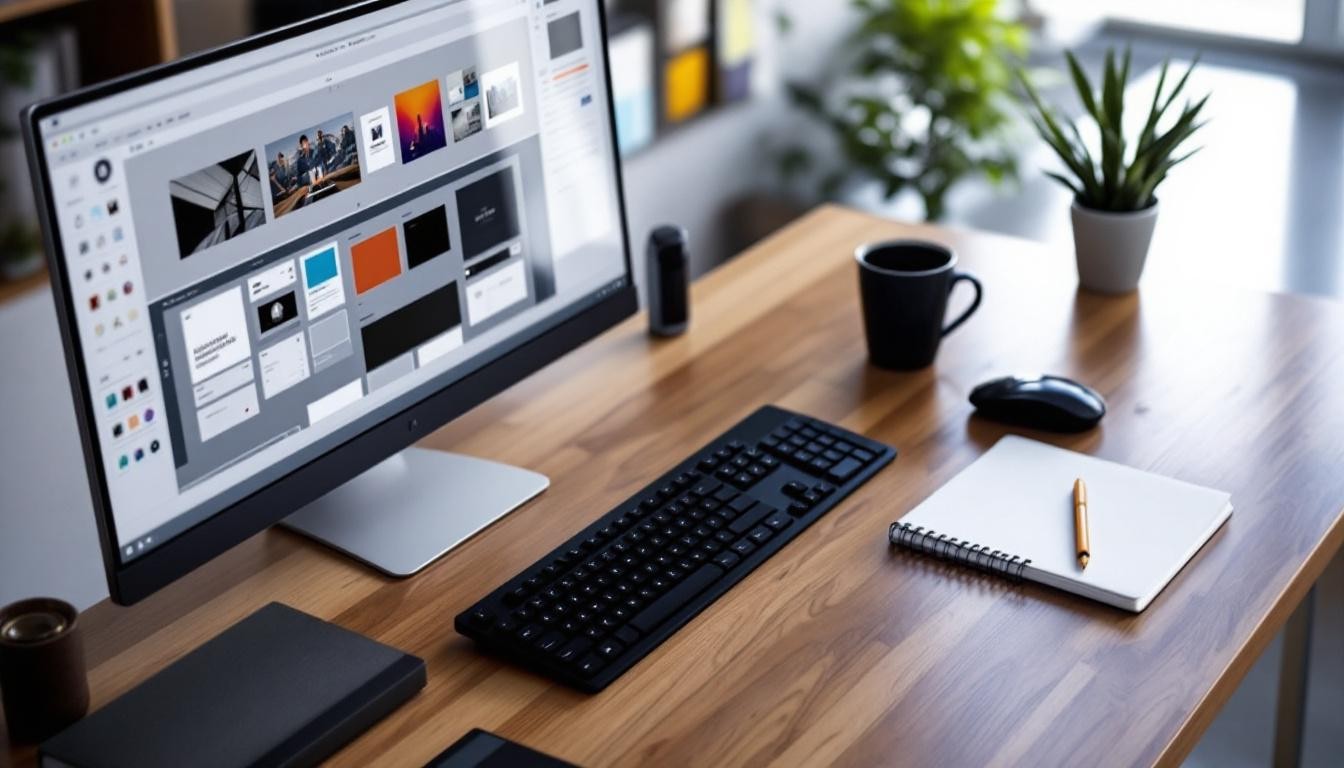
At Kolorfirst LLC, we understand the critical role of web page layout design in creating engaging and effective websites.
A well-structured layout not only enhances visual appeal but also improves user experience and drives conversions.
In this post, we’ll explore key elements, design principles, and practical tools for crafting impactful web page layouts that resonate with your audience.
What Makes a Web Page Layout Effective?
The Power of Visual Hierarchy
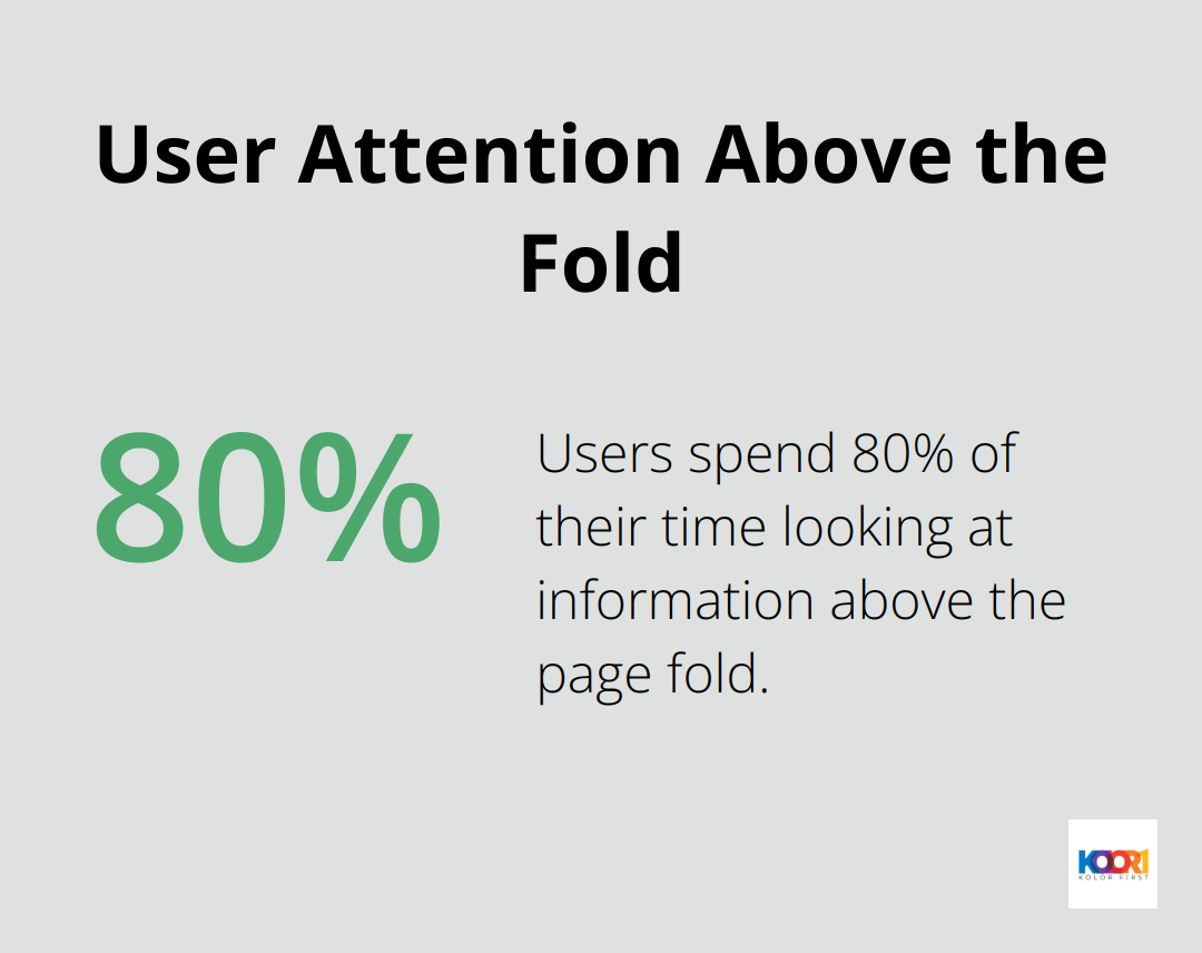
Visual hierarchy forms the foundation of effective web design. It guides users through your content seamlessly and purposefully. A study by Nielsen Norman Group reveals that users spend 80% of their time looking at information above the page fold. This insight underscores the importance of placing your most critical content front and center.
To create a strong visual hierarchy:
- Emphasize important elements with size and color
- Position critical information at the top of the page
- Group related items together
- Separate different sections with whitespace
Balancing Content and Whitespace
Whitespace (or negative space) plays a vital role in readability and focus. A study from Wichita State University found that proper use of whitespace between paragraphs and in margins increases comprehension by almost 20%. To leverage this:
- Leave ample margins around your main content
- Use line spacing of 1.5 to 2 for improved readability
- Add padding around images and between sections
Navigation That Guides Users
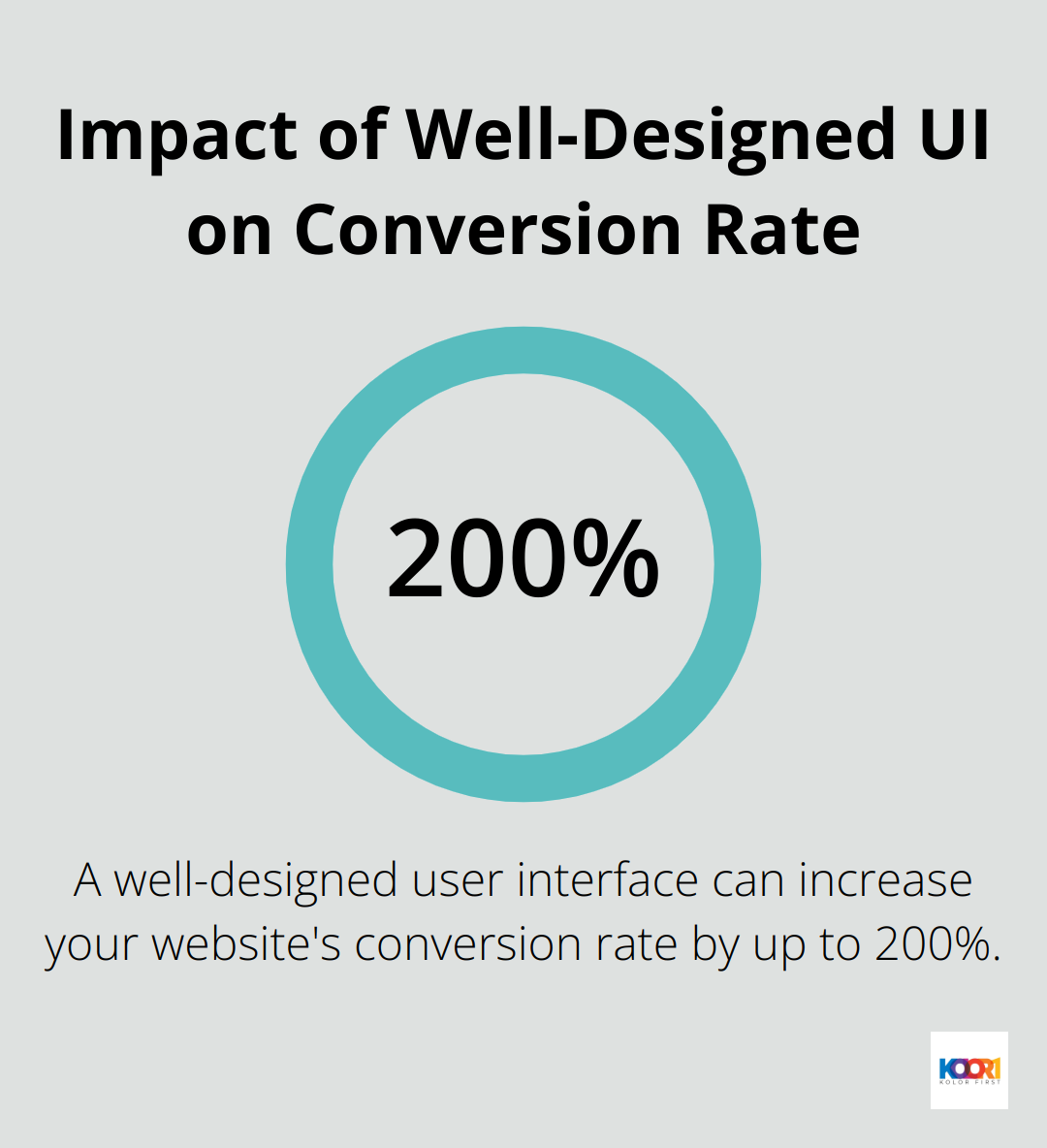
Consistent navigation keeps users engaged and improves their experience. Forrester Research indicates that a well-designed user interface can increase your website’s conversion rate by up to 200%. To achieve this:
- Keep your main navigation menu visible and consistent across all pages
- Use descriptive labels for menu items
- Implement a search function for larger sites
- Include a clear call-to-action on each page
The Impact of Responsive Design
In today’s multi-device world, responsive design is non-negotiable. It ensures your layout adapts seamlessly to different screen sizes (from desktops to smartphones). Google reports that 61% of users are unlikely to return to a mobile site they had trouble accessing, and 40% visit a competitor’s site instead.
To create an effective responsive layout:
- Use flexible grid layouts
- Implement breakpoints for different device sizes
- Optimize images for various screen resolutions
- Prioritize content for mobile views
As we move forward, let’s explore the design principles that will help you put these elements into practice and create layouts that not only look good but also function intuitively.
How to Design Layouts That Convert
At Kolorfirst LLC, we’ve observed how effective layout design boosts conversion rates significantly. Let’s explore key design principles that create layouts which not only look great but also drive results.
The Psychology of User Scanning Patterns
Users scan web pages rather than read them. Understanding this behavior shapes effective layout design. The F-pattern and Z-pattern are two common scanning patterns that inform content structure.
The F-pattern prevails on text-heavy pages. Users typically scan the top line, then move down the left side, occasionally reading across. This pattern suits blogs or articles well. To leverage it:
- Position your most important content in the first two paragraphs
- Use descriptive subheadings to break up text
- Start paragraphs with information-carrying words
The Z-pattern suits pages with less text and more visual elements. Users’ eyes move in a Z shape: across the top, diagonally to the bottom left, then across the bottom. This pattern works effectively for landing pages or homepages. To utilize it:
- Position your logo in the top left
- Place your call-to-action button in the bottom right
- Use the diagonal area for your main value proposition
Grid Systems: The Foundation of Responsive Design
Grid systems provide a framework for organizing content and ensuring consistency across devices. A responsive grid or fluid grid automatically adjusts its layout and spacing based on the screen size of the device it’s viewed on.
A 12-column grid offers flexibility due to its various column combinations (2, 3, 4, or 6) that maintain proportional spacing. When implementing a grid system:
- Define a maximum content width (e.g., 1200px) to prevent overly stretched layouts on large screens
- Use relative units like percentages or em for flexibility
- Set appropriate breakpoints for different devices (typically 320px, 768px, and 1024px)
Tools like CSS Grid and Flexbox simplify the implementation of responsive grids. They provide powerful layout control with minimal code, allowing for complex layouts that adapt to any screen size.
The Impact of Color and Typography on User Behavior
Color and typography guide user attention and influence behavior. Choosing the right colors can subtly influence how users feel about a brand or product, ultimately affecting user behavior and conversion rates.
When choosing colors for your layout:
- Use contrasting colors for important elements like call-to-action buttons
- Employ a consistent color scheme that aligns with your brand identity
- Consider color psychology (e.g., blue for trust, green for growth)
Typography holds equal importance. To optimize your typography:
- Use a font size of at least 16px for body text
- Maintain a line length of 50-75 characters for optimal readability
- Choose fonts that align with your brand personality (serif for traditional, sans-serif for modern)
These principles serve as guidelines, not rigid rules. Always test your designs with real users to ensure effectiveness for your specific audience and goals. In the next section, we’ll explore practical tools and techniques to implement these design principles effectively.
How to Implement Effective Web Page Layouts
The Power of Wireframing
Wireframing serves as the blueprint for successful web layouts. It allows quick experimentation with different structures. Tools like Figma or Adobe XD offer collaborative features and ease of use for this process.
When you create wireframes, focus on:
- Content hierarchy: Arrange elements by importance
- User flow: Plan how users will navigate your site
- Responsive layouts: Design versions for various screen sizes
A well-crafted wireframe can reduce design time and align stakeholders early in the process.
CSS Grid and Flexbox Mastery
After wireframe approval, CSS brings your design to life. Grid and Flexbox provide unparalleled control over page structure.
CSS Grid and Flexbox create versatile, responsive layouts with advanced web design techniques. Here’s a simple example:
“`css.container { display: grid; grid-template-columns: repeat(12, 1fr); gap: 20px;}
.header { grid-column: span 12; }.main-content { grid-column: span 8; }.sidebar { grid-column: span 4; }“`
Flexbox shines for one-dimensional layouts within your grid. It aligns items in a row or column effectively:
css.nav-menu { display: flex; justify-content: space-between; align-items: center;}
A/B Testing for Layout Optimization
Even thoughtfully designed layouts can improve. A/B testing is a quantitative research method that tests two or more design variations with a live audience to determine which variation performs best.
Google Optimize or VWO (Visual Website Optimizer) simplify A/B test setup. When you test layouts, consider:
- Button placement and color
- Content order
- Image placement
- Form design
Small changes often lead to significant improvements.
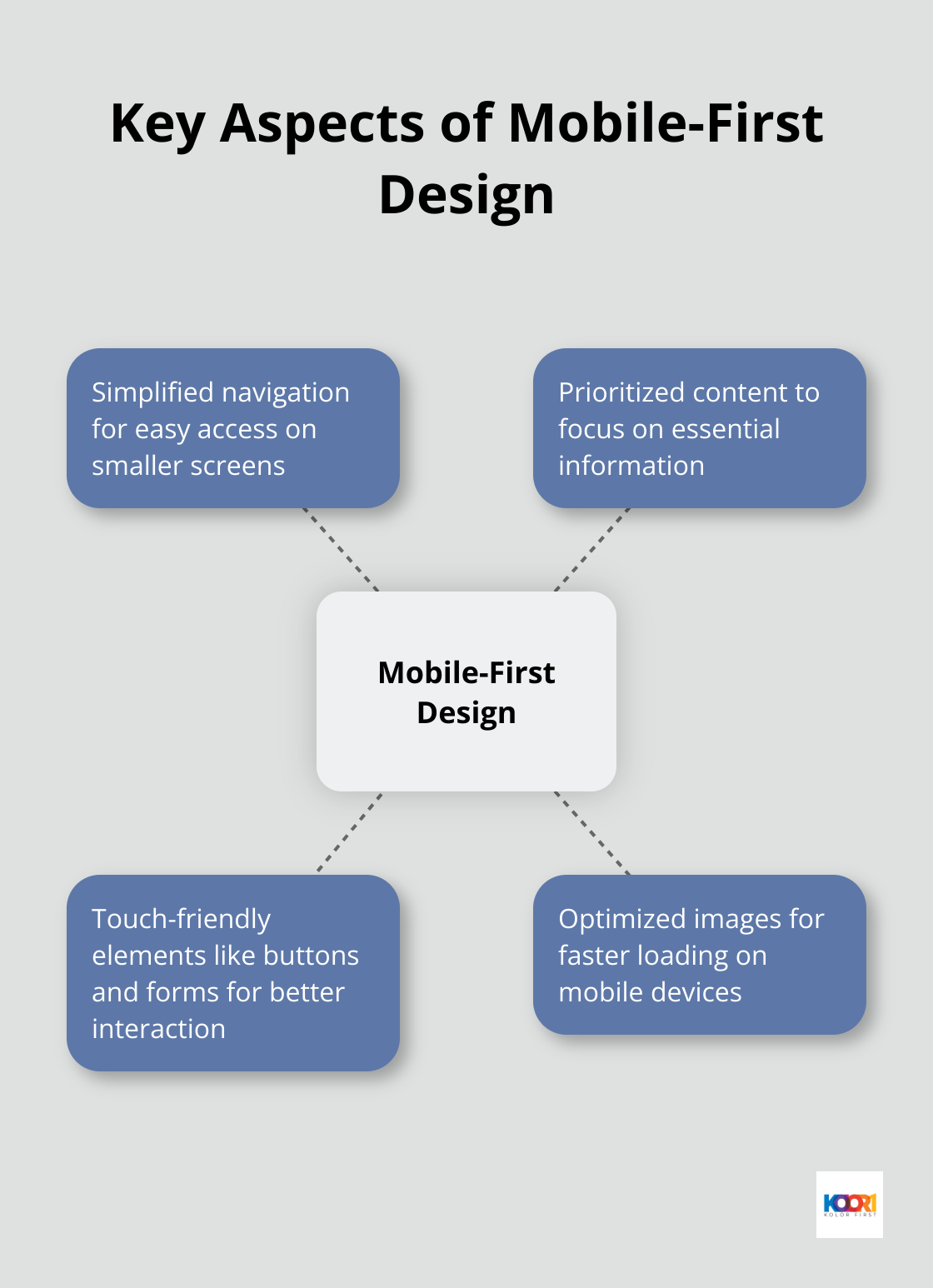
Mobile-First Design Approach
A mobile-first approach prioritizes the design for smaller screens before scaling up to larger devices. This strategy ensures a smooth user experience across all devices.
Key aspects of mobile-first design include:
Performance Optimization
Fast-loading pages improve user experience and search engine rankings. To optimize your layout’s performance:
- Minimize HTTP requests
- Compress images (without sacrificing quality)
- Use browser caching
- Minify CSS and JavaScript files
Tools like Google PageSpeed Insights can help identify areas for improvement.
Final Thoughts
Web page layout design combines artistry and scientific principles to create effective structures. Visual hierarchy, content organization, and responsive design form the foundation of layouts that drive results. User-centered approaches guide visitors effortlessly through sites, supporting business goals and improving conversion rates. Emerging trends in AI, accessibility, and micro-interactions open new possibilities for personalized and interactive layouts.
At Kolorfirst LLC, we specialize in innovative branding and digital marketing solutions that elevate businesses. Our team creates unique brand identities and enhances online presence through compelling user experiences. We strive to deliver exceptional results and measurable growth for our clients.
Effective web page layout design requires continuous refinement and optimization. Stay curious, test frequently, and prioritize user needs in your next web design project. These principles will equip you to create layouts that capture attention and drive meaningful engagement and conversions.