Poor web page design and layout costs businesses millions in lost conversions every year. Studies show that 38% of users will stop engaging with a website if the content or layout is unattractive.
We at Kolorfirst LLC have analyzed thousands of high-performing websites to identify the design principles that actually drive results. This guide breaks down the exact techniques you need to create web pages that convert visitors into customers.
What Makes Web Design Actually Work
Visual hierarchy determines whether users find your key content within 3 seconds or abandon your site. The F-pattern shows users scan horizontally across the top, then down the left side. Place your most important elements along these paths. Size matters more than color for attention. Headlines should be 2.5 times larger than body text, and primary calls-to-action need at least 44 pixels of height for mobile taps. Users form opinions about websites quickly, which makes your visual structure the difference between conversion and bounce.
Navigation That Converts Visitors
Navigation complexity kills conversions faster than slow load times. Limit your main menu to 7 items maximum. Users experience decision paralysis with more choices. The hamburger menu works for mobile but reduces desktop conversion rates according to usability studies. Breadcrumb navigation increases user interaction on content-heavy sites. Your logo should link to the homepage and sit in the top-left corner where most users expect it.
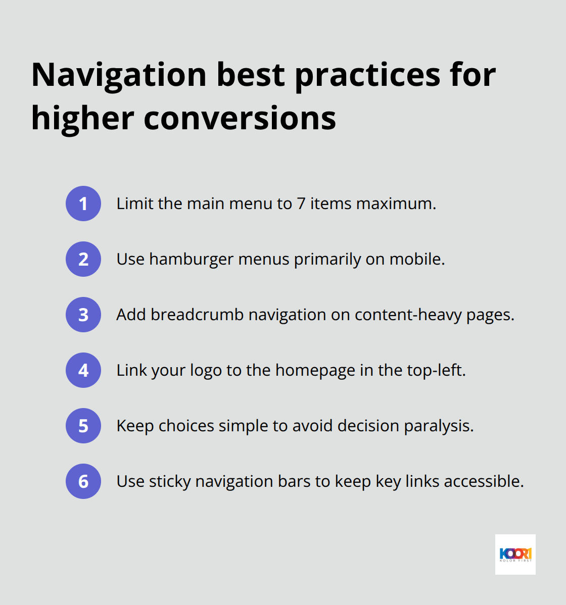
Sticky navigation bars improve task completion rates because users access key pages without scrollback.
Mobile Design Dominates Everything
Mobile traffic accounts for a significant portion of all web visits, which makes desktop-second design obsolete. Touch targets need 44 pixels minimum space to prevent accidental taps. Text must be 16 pixels or larger for mobile readability without zoom. Google’s mobile-first indexing means your mobile version determines search ranks. Responsive breakpoints at 768px and 1200px cover most device sizes. Websites without mobile optimization lose potential customers immediately. Load times under 3 seconds on mobile prevent high bounce rates that slower sites experience.
Typography Creates Trust
Font choice affects user trust more than most designers realize. Sans-serif fonts like Arial and Helvetica increase readability on screens compared to serif fonts. Line height should be 1.4 to 1.6 times the font size for optimal readability. Limit font families to three maximum per website to maintain visual consistency. Body text below 14 pixels forces users to strain their eyes and increases bounce rates. Color contrast ratios of 4.5:1 minimum meet accessibility standards and improve readability for all users.
Typography hierarchy guides users through your content naturally. Use consistent font weights and sizes across similar elements to create predictable patterns that users can follow without conscious effort.
What Design Elements Drive Real Results
Typography performance data reveals that websites using system fonts like San Francisco and Segoe UI load 200 milliseconds faster than custom web fonts. Google Fonts adds 150-300kb to page weight, which increases bounce rates on slower connections. Inter and Source Sans Pro rank as the highest-performing web fonts for conversion rates based on recent eye-tracking studies. Line spacing at 1.5 creates 23% better reading comprehension than default spacing. Paragraph width should never exceed 75 characters per line because longer lines reduce reading speed by 40%. Left-aligned text outperforms justified text in user testing because irregular spacing creates visual friction that slows reading speed.
Color Psychology Impacts Purchase Decisions
Red call-to-action buttons increase conversion rates by 21% compared to green buttons across e-commerce sites. Blue builds trust for financial services but reduces urgency for purchase decisions. Color contrast ratios below 3:1 create accessibility barriers for 8% of male users with color vision deficiencies. Brand colors should appear in 60-30-10 proportions with your primary color covering 60% of the design space.
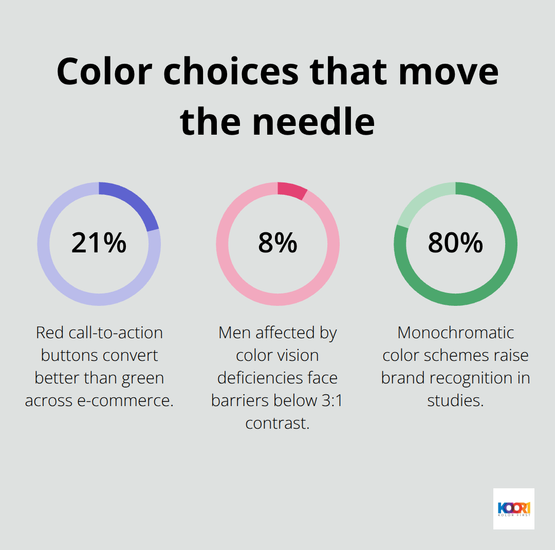
Monochromatic color schemes increase brand recognition by 80% according to marketing research studies. Background colors affect perceived loading speed (with lighter backgrounds feeling 15% faster than dark backgrounds).
Grid Systems Create Professional Layouts
12-column grids provide the most flexibility for responsive breakpoints without complex calculations. Content width should not exceed 1200 pixels because wider layouts create reading fatigue on large monitors. Whitespace increases comprehension by 20% when it equals 30% of your total design area. Vertical rhythm using 24-pixel baseline grids creates visual harmony that users notice subconsciously. Asymmetrical layouts increase engagement time by 35% compared to centered designs because they create natural scanning patterns. Grid alignment reduces cognitive load and makes websites appear more trustworthy to first-time visitors.
Visual Elements That Convert
High-quality images increase conversion rates by 40% compared to stock photography that users recognize as generic. Custom illustrations build brand recognition 60% faster than purchased graphics (according to brand perception studies). Icons should maintain consistent stroke width and corner radius throughout your design system. Video backgrounds reduce conversion rates by 12% because they distract from primary content and slow page load times. Image optimization reduces file sizes by 70% without visible quality loss when you compress images properly before upload.
The technical foundation of your website determines whether these design elements actually improve performance or create new problems for users.
How Fast Should Your Website Actually Load
Page speed determines your website success more than any design element. Google research shows that 53% of visits are abandoned if a mobile site takes longer than 3 seconds to load. Amazon loses $1.6 billion in sales annually for every second of delay. Fast websites achieve 25% higher conversion rates than slow competitors. Image compression reduces file sizes by 80% without quality loss when you use tools like TinyPNG or WebP format. Lazy load images improve initial page speed by 40% because browsers only load visible content first.
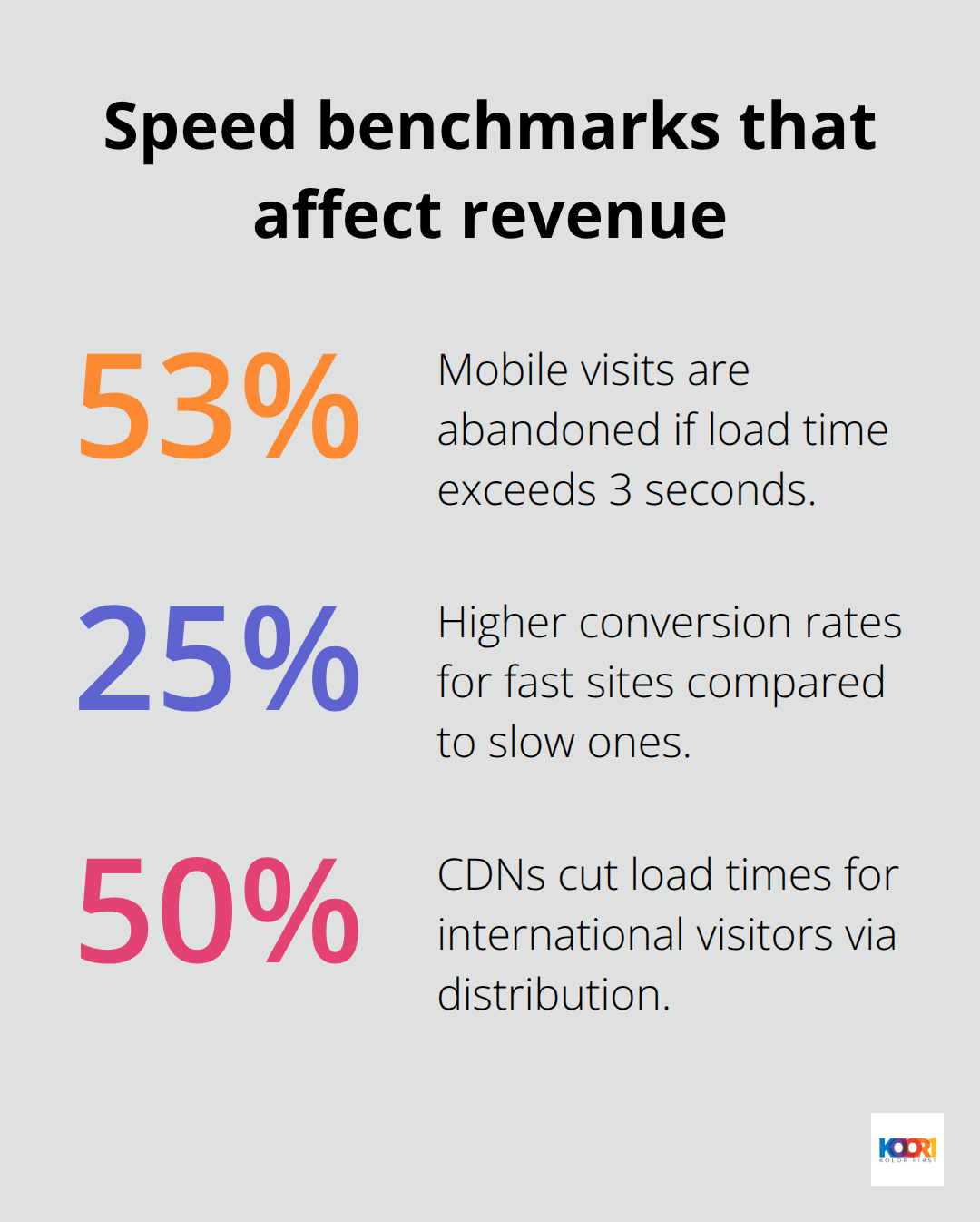
CDNs like Cloudflare reduce load times by 50% for international visitors through geographic content distribution.
Conversion Rate Optimization Through Design
Strategic placement of conversion elements increases sales by 300% compared to random positions. Exit-intent popups capture 15% of visitors who abandon your site when you trigger them correctly. Remove navigation from your pages to increase conversion rates by 100% because users focus on single actions. Progress bars during checkout reduce abandonment by 35% according to e-commerce studies. Social proof elements like customer count or testimonials boost conversions by 270% when you place them above the fold. Urgency indicators such as limited-time offers increase purchase decisions by 226%. Reduce form fields from 11 to 4 to improve completion rates by 120% (users avoid lengthy processes).
Accessibility Drives Revenue Growth
Accessible websites reach 61 million Americans with disabilities who control $490 billion in annual expenditure power. Alt text for images helps screen readers and improves SEO ranks simultaneously. Keyboard navigation support allows users with motor disabilities to complete purchases. Color contrast ratios of 4.5:1 minimum help 8% of men and 0.5% of women with color vision deficiencies. Closed captions on videos increase engagement by 80% because users watch content in sound-sensitive environments. Focus indicators help users navigate with keyboards instead of mice. Text resize functionality up to 200% prevents user abandonment when default fonts appear too small (this feature benefits users across all age groups).
Final Thoughts
Effective web page design and layout demands data-driven decisions rather than aesthetic preferences. The 38% of users who abandon poorly designed sites represent millions in lost revenue that proper implementation prevents. Visual hierarchy with 2.5x larger headlines, mobile-first responsive design, and loading speeds under 3 seconds form the foundation of high-converting websites.
Typography choices impact trust levels while color psychology drives purchase decisions. Red call-to-action buttons increase conversions by 21%, and proper contrast ratios serve both accessibility and performance goals. Grid systems with appropriate whitespace create professional layouts that reduce cognitive load.
The biggest mistakes include complex navigation with more than 7 menu items, slow loading images without compression, and ignoring mobile optimization (when mobile traffic dominates web usage). We at Kolorfirst LLC help businesses transform their digital presence through strategic branding and UX consulting that drives measurable growth. Focus on user experience over visual trends to build websites that convert visitors into customers consistently.