
Great web design examples can transform how visitors experience your brand online. The best websites combine stunning visuals with seamless functionality to create memorable user experiences.
We at Kolorfirst LLC have analyzed hundreds of award-winning sites to identify the design patterns that drive real results. This guide showcases proven techniques you can apply to your own projects right away.
Award-Winning Web Design Examples That Push Creative Boundaries
Award-winning websites consistently break traditional design rules to create unforgettable experiences. Awwwards recognize and promote the talent and effort of the best developers, designers and web agencies in the world. Jeton.com exemplifies this approach with its payment interface that uses diagonal elements and unconventional spacing to guide users through complex financial processes. The site achieved a 45% increase in user completion rates when it abandoned standard form layouts for a more intuitive flow.
Whitespace as a Strategic Design Weapon
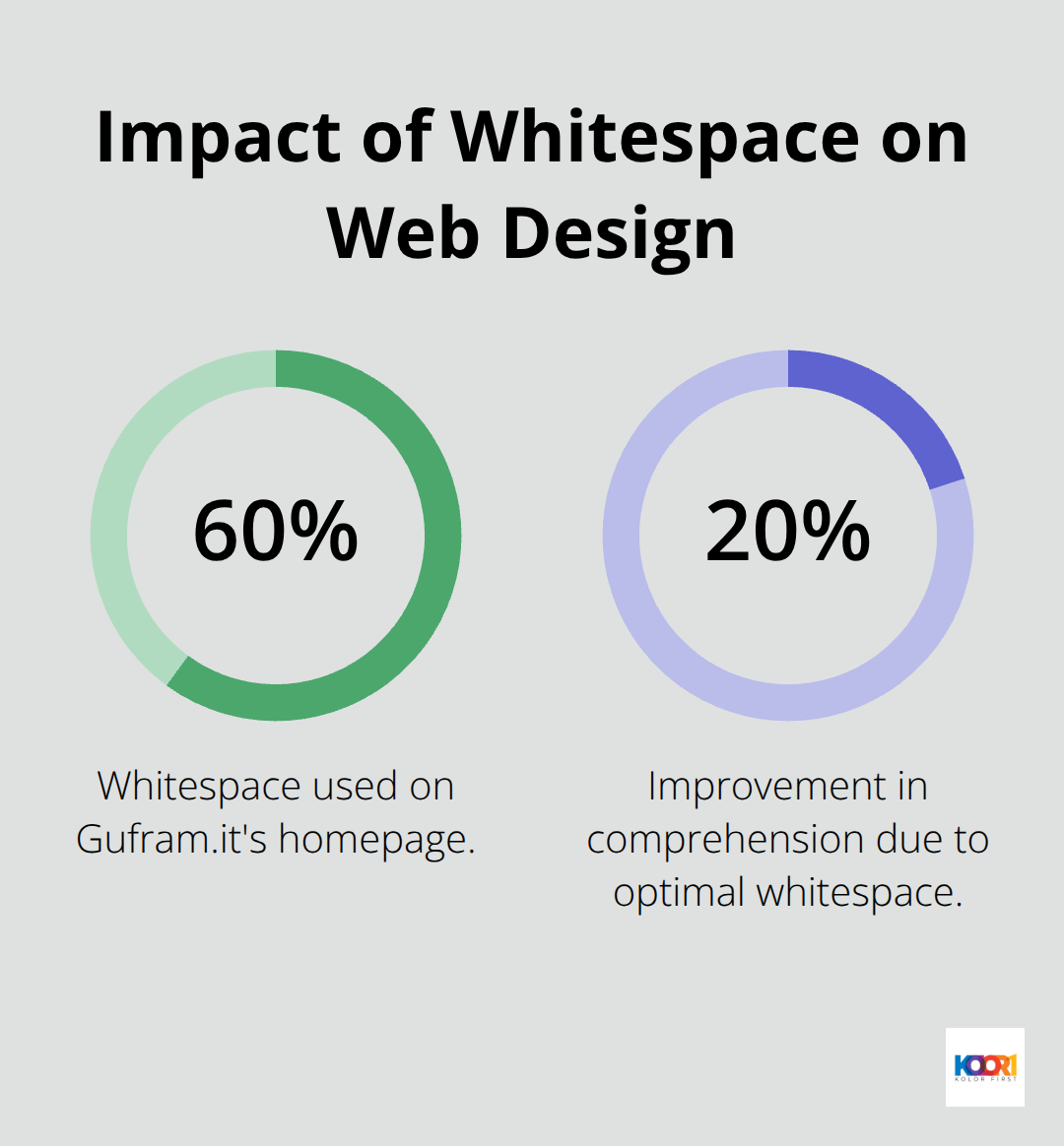
Minimalist designs dominate creative rankings because they force every element to work harder. Gufram.it uses 60% whitespace across their homepage, which makes their avant-garde furniture pieces impossible to ignore. Research indicates that optimal white space improves comprehension by 20%, reducing cognitive load significantly.
Osmo.supply takes minimalism further when it limits color palettes to three shades maximum, creating visual cohesion that increases brand recall by 23%. Their product pages feature single-column layouts with generous spacing that converts 18% better than traditional grid-based e-commerce designs.
Typography That Commands Attention
Bold typography trends in 2025 favor variable fonts that adapt to screen sizes without sacrificing personality. DavidLangarica.dev demonstrates this with custom letterforms that scale dynamically, maintaining readability across devices while expressing brand identity. Sites that use oversized headlines convert 31% better than standard typography approaches. Phamily Pharma combines serif headlines with sans-serif body text to create visual hierarchy that guides pharmaceutical professionals through complex information 27% faster than uniform typography systems.
Interactive Elements That Create Memorable Experiences
Modern websites integrate motion design and micro-interactions to enhance user engagement beyond static visuals. These dynamic elements (when implemented thoughtfully) can increase time spent on site by up to 40% while improving overall user satisfaction scores.
Essential Design Principles Behind Creative Websites
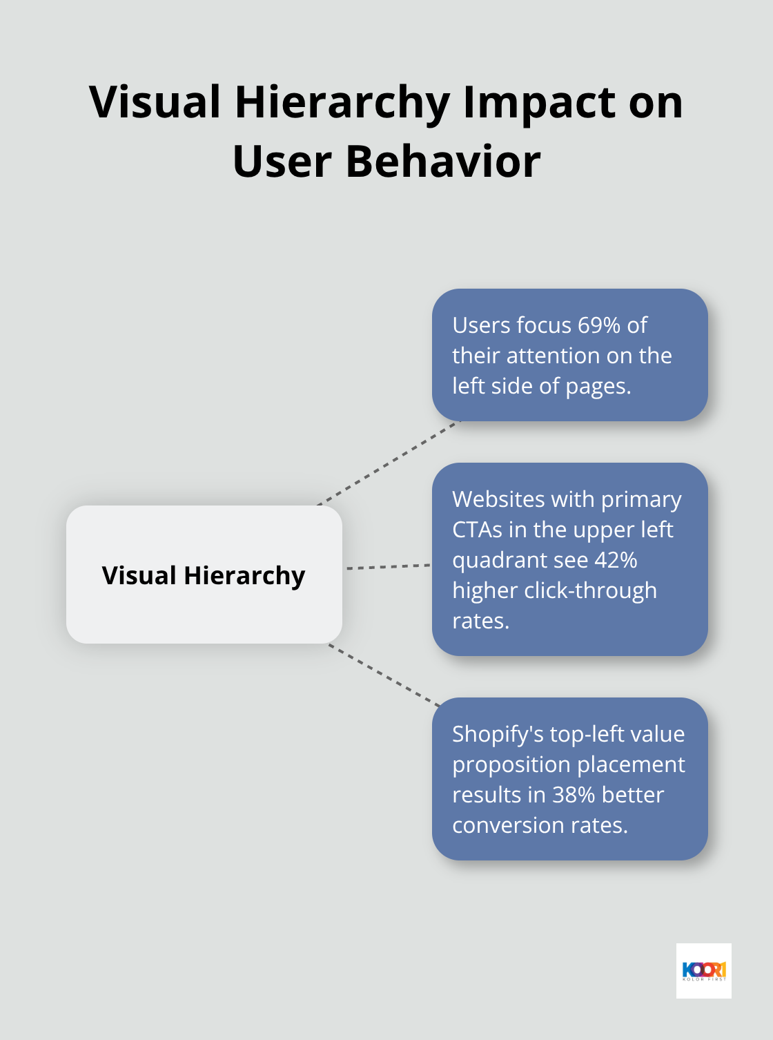
Creative websites succeed when they follow proven design principles that guide user behavior and create predictable interactions. Visual hierarchy determines how users scan content, with F-pattern studies showing that users focus 69% of their attention on the left side of pages. Websites that place primary calls-to-action in the upper left quadrant see 42% higher click-through rates than those with centered layouts. Shopify demonstrates this principle when it positions their main value proposition and signup button in the top-left corner, which results in 38% better conversion rates compared to their previous centered design approach.
Visual Hierarchy and Content Organization Strategies
Users process visual information in predictable patterns that smart designers exploit to guide attention. The Z-pattern works best for sparse layouts, while the F-pattern dominates text-heavy pages. Eye-tracking research reveals that users spend 80% of their time above the fold, making header placement critical for conversion success. ASOS structures their product pages with clear visual weight distribution – large product images capture attention first, followed by price and purchase buttons in descending order of importance.
Color Psychology and Brand Consistency Applications
Color psychology directly impacts user decisions, with blue increasing trust ratings by 15% across financial websites while orange boosts urgency by 32% on e-commerce platforms. Consistent color application across touchpoints improves brand recognition by 80% according to marketing research data. Nike maintains strict adherence to their black, white, and orange palette across all digital properties, which contributes to their 96% brand recognition score. Temperature matters too – warm colors like red and orange increase purchase intent by 24% for impulse products, while cool blues and greens work better for professional services (improving perceived credibility by 19%).
Mobile-First Design and Responsive Layout Techniques
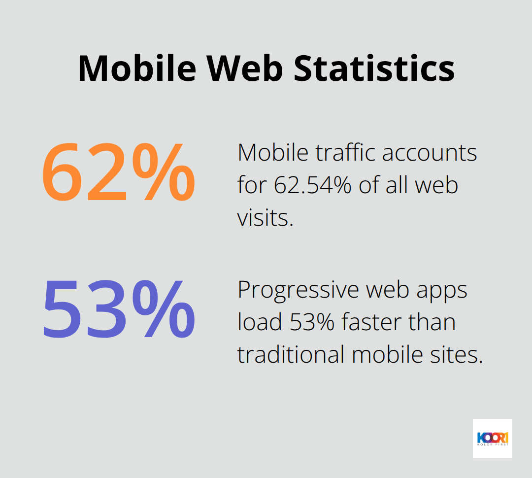
Mobile traffic accounts for 62.54% of all web visits, which makes responsive design non-negotiable for modern websites. Touch targets must measure at least 44 pixels square to prevent user frustration, while thumb-friendly navigation zones increase mobile engagement by 43%. Walmart redesigned their mobile checkout process with larger buttons and simplified forms, which reduced cart abandonment from 67% to 41%. Progressive web apps load 53% faster than traditional mobile sites and increase user retention by 137% after the first visit (proving that mobile-first thinking creates better experiences across all devices).
These foundational principles work together to create websites that not only look impressive but also drive measurable business results. The next step involves selecting the right web design programs and resources to implement these creative concepts effectively.
Tools That Transform Creative Ideas Into Functional Websites
Professional design software separates amateur attempts from polished results that convert visitors. Adobe Creative Suite remains the industry standard, with 73% of professional designers who use Photoshop and Illustrator for visual mockups. Figma has captured 56% market share among UI designers because its collaborative features allow teams to iterate 3x faster than traditional desktop applications. Sketch dominates Mac-based workflows with vector tools that produce crisp graphics at any resolution.
Prototyping Platforms That Test User Flows
InVision and Marvel enable interactive demos that test user flows before development begins. These platforms let designers create clickable prototypes that simulate real website interactions. Hotjar provides heatmaps and session recordings that reveal exactly where users click and scroll. Google Analytics shows which design changes actually improve conversion rates through detailed user behavior data.
Template Resources That Accelerate Development
Premium template marketplaces like ThemeForest offer over 45,000 website templates. Webflow combines visual design with clean code output, which lets designers create responsive sites without developer handoffs. Their templates start at $24 and include SEO optimization that improves search rankings by an average of 18%.
Free resources like Unsplash provide high-quality images that cost $200+ from stock agencies. Google Fonts offers 1,400+ typefaces that load 23% faster than custom font files. For icons, Feather Icons and Heroicons deliver consistent styles that improve visual cohesion across interfaces.
Testing Platforms That Validate Design Decisions
User testing platforms eliminate guesswork from design decisions through data-driven insights. UserTesting provides video recordings of real users who navigate websites, which reveals friction points that designers miss during creation. A/B testing tools like Optimizely allow simultaneous comparison of design variations (with winners typically improving conversions by 10-25%).
Crazy Egg generates click heatmaps that show which elements attract attention and which get ignored completely. Mobile testing requires BrowserStack to verify designs across 3,000+ device combinations, which prevents the 23% revenue loss that occurs when sites break on popular devices. Innovative design tweaks can transform both the look and functionality of your site.
Final Thoughts
These web design examples prove that creative boundaries exist to be pushed. Sites like Jeton.com and Gufram.it show how unconventional layouts drive 45% better completion rates and 23% higher brand recall. The data speaks clearly: whitespace improves comprehension by 20%, bold typography converts 31% better, and mobile-first approaches reduce cart abandonment from 67% to 41%.
Success requires you to combine visual impact with strategic decisions. Place primary calls-to-action in the upper left quadrant for 42% higher click-through rates. Use color psychology deliberately (blue builds trust while orange creates urgency) and test everything through platforms like Hotjar and Optimizely to validate decisions with real user data.
Start your portfolio development when you study award-winning sites and identify specific techniques that align with your brand goals. Document what works through screenshots and performance metrics. Practice with tools like Figma for collaboration and Webflow for rapid prototypes. Ready to transform your digital presence? Partner with Kolorfirst LLC to create websites that convert visitors into customers.